 Hi folks,
Today I wanted to share about two of the playable characters in Causeway, because I think they're a neat example of what we explore in this game.
We call them Lute & Lyre. They are a character duo — they must be chosen together by two players.
How this came together
One of the most innovative lane-pushing characters of the past decade is surely Cho'gall, the loveable two-headed ogre from Heroes of the Storm. The game has fantastic designs, and this was one of the cleverest.
I knew we'd explore something similar in Causeway, with our own twist. But I wasn't sure what it would be.
Separately, I'd been musing on multi-unit characters like Meepo (Dota 2) and Gemini (HoN). These characters interest me most when they challenge and reward players for distributing attention across the map.
However, during team-fights, the player's cognitive load would often decrease as all their attention and units collapse on a key target. No doubt there is a lot of skill handling the hotkeys and multiple units to do that, but it is a different skill to "distributing attention".
I wondered — what happens if a player couldn't bring their units together? That thought planted a seed of inspiration...
Enter Lute. Enter Lyre.
They are two "identical" characters, in separate bodies controlled by one player each. And they take this Pledge:
Thinking of You
You can never, ever be close to your counterpart. If you are within 18 radius, you are both pushed apart evenly (unless one of you is near the edge of the map).
Whenever you receive a Shield or swap weapons, you are Cleansed.
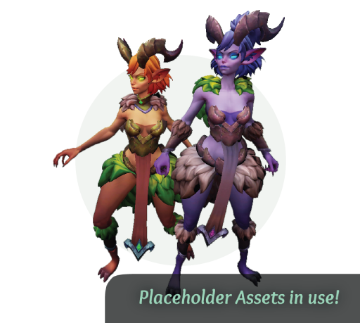 This is a character duo which challenges you to attend to yourself and your counterpart, while rarely if ever being on the same screen.
I have heard them described as "the opposite of Cho'gall". I suppose that's true!
The dynamic is definitely a curveball, and players often have to stumble around for a while figuring out how to... heal at the fountain? Right, can't do that at the same time. And team-fights are always 4v5 unless... well, you get the picture.
In response, we've tried to keep the cognitive load of the kits themselves simple. For example:
Trading Tunes
Swap weapons with your counterpart.
- With the Spear, your attacks are melee.
- With the Daggers, your attacks are ranged.
That's the one difference between Lute and Lyre; at any time one is melee and the other is ranged. You can both initiate a swap, though it has a long cooldown.
Again, there's a long history of form-swapping characters to learn from, going right back to Troll Warlord (DotA). Finding the fun is about marrying the right ideas — we're still figuring out the right ones for Lute & Lyre.
I can share that Faris (Dawngate) inspired some nice unlockable upgrades, including:
- Your Melee attacks deal (+8% of target's missing life) damage
- Your Ranged attacks deal (+2% of target's current life) damage
Of course, you may want to coordinate choices with your counterpart!
Autumn Plans
We have some more play-tests planned before the end of the year.
While we really should advertise this better — the best way to get involved with us is through a community, as it makes coordinating games much easier. Reach out on discord if this sounds like you!
Stay tuned,
Softmints
 Recently, we've been revisiting some of the macro concepts in Causeway.
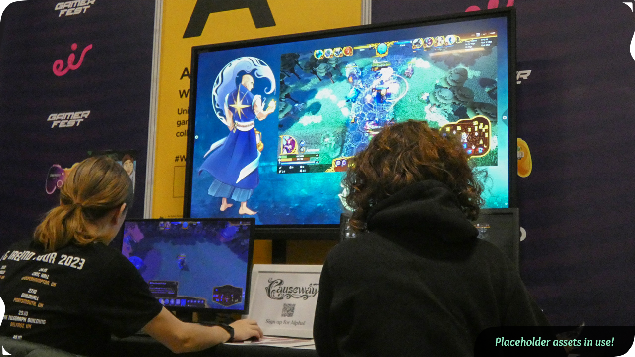
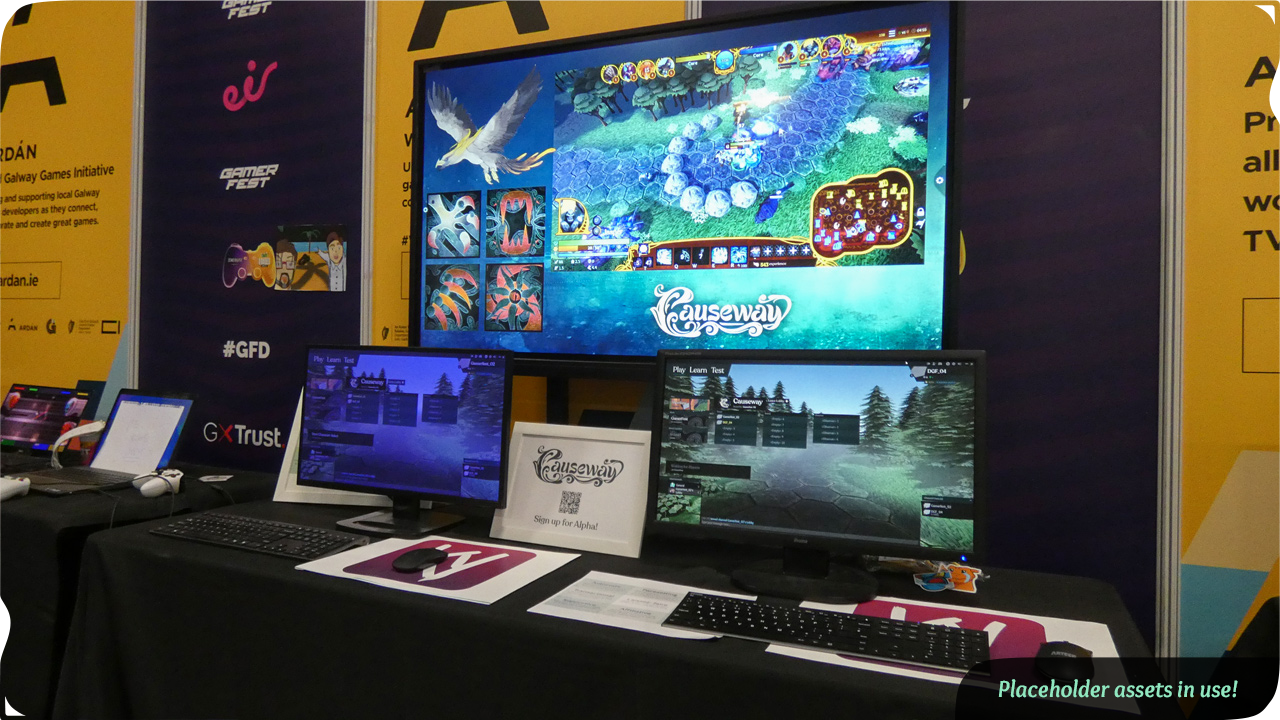
 As some of you may know, we're an Irish studio — and our biggest local game show is GamerFest!
 Last time, we shared some thoughts about depth in Causeway, and how to design for it without adding needless complexity.
 Greetings all!
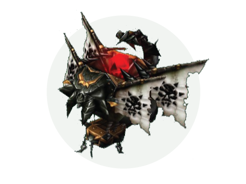 In this game, players can buy a transport unit, hop inside it with teammates, and the transport itself had a Teleport ability.